
Vuetify에서 Icon 설정과 활용
업데이트: Link
Vuetify에서 Icon 설정과 활용
사용자에게 더 직관적이고 보기 편한 사용자 UI를 위해 Icon을 적극 활용하려고 노력중입니다. 그렇기 때문에 일관성있고 한눈에 의미 파악이 가능한 아이콘을 선정 혹은 제작하는 작업이 함께 진행되고 있습니다.
현재는 적용중인 UI framework의 공식 디자인 아이콘인 Material-design-icons를 기본 베이스로 사용하고 있습니다.
Vuetify 지원 가능한 Icon 라이브러리
Vuetify는 Material Design Icons, Material Icons, Font Awesome 4 및 Font Awesome 5를 지원하는 부트스트랩으로 제공됩니다. 기본적으로 응용 프로그램은 기본적으로 Material Design Icons를 사용하도록 설정됩니다.
Icon 설정
우리는 mdi 아이콘을 사용하고 있지만 다른 아이콘으로 바꿀 수 있는 가능성을 배제하지 않기 때문에 사용중인 아이콘을 포함하여 각 아이콘을 어떻게 설치하고 사용하는지 알아두어야 합니다.
설정 방법에 대하여 Vuetify - Icon Fonts 페이지에서 자세하게 설명하고 있기 때문에 큰 어려움 없이 설정할 수 있습니다.
가장 기본적인 설정은 Vuetify 선언을 하면서 icons 설정을 삽입하는 방법입니다. 기본적으로 제공되는 설정은 다음과 같이 되어 있습니다.
// src/plugins/vuetify.js

import Vue from 'vue'
import Vuetify from 'vuetify/lib'

Vue.use(Vuetify)

export default new Vuetify({
  icons: {
    iconfont: 'mdi', // 'mdi' || 'mdiSvg' || 'md' || 'fa' || 'fa4' || 'faSvg'
  },
})
mdi-icon 설정
가장먼저 기본설정되어 있는 mdi 사용을 위한 설치 방법입니다.
CDN을 이용한 설치
인터넷접속이 가능한 환경이라면 가장 손쉬운 사용 방법이 CDN을 통한 설치입니다. 그냥 아래와 같은 한줄을 index.html 파일의 <head>내부에 삽입하면 됩니다.
<link href="https://cdn.jsdelivr.net/npm/@mdi/font@5.x/css/materialdesignicons.min.css" rel="stylesheet">
디펜던시에 추가하여 설치
혹은 외부 인터넷이 단절되어 있거나 update로 인한 변경을 포함하고 싶지 않다면 npm 혹은 yarn 을 통해 디펜던시를 설정하여 설치할 수도 있습니다.
# 프로젝트 루트의 쉘 커맨드로
yarn add @mdi/font -D
# OR
npm install @mdi/font -D
// src/plugins/vuetify.js

import '@mdi/font/css/materialdesignicons.css' // Ensure you are using css-loader
import Vue from 'vue'
import Vuetify from 'vuetify/lib'

Vue.use(Vuetify)

export default new Vuetify({
  icons: {
    iconfont: 'mdi', // default - only for display purposes
  },
})
mdi-icon JS SVG 설치
@mdi/js모듈을 통해 SVG 아이콘을 활용할 수 있습니다. Production에 효율적으로 활용하고자 할때 권장되며 기본 아이콘 이상으로 쓸 계획이라면 이것만 포함하면 됩니다.
# 프로젝트 루트의 쉘 커맨드로
yarn add @mdi/js -D
#  OR
npm install @mdi/js -D
iconfont를 mdiSvg로 선언합니다.
// src/plugins/vuetify.js

import Vue from 'vue'
import Vuetify from 'vuetify/lib'

Vue.use(Vuetify)

export default new Vuetify({
  icons: {
    iconfont: 'mdiSvg',
  },
})
사용되는 아이콘만 사용자 정의하여 번들 크기를 줄일 수 있습니다.
<!-- Vue Component -->

<template>
  <v-icon></v-icon>
</template>

<script>
  import { mdiAccount } from '@mdi/js'

  export default {
    data: () => ({
      svgPath: mdiAccount
    }),
  }
</script>
Material Icons
앞서와 같이 CDN 방식과 dependency 방식이 있습니다.
CDN을 이용한 설치
우선 CDN 방식은 index.html 파일의 <head> 부분에 아래의 코드를 삽입하면 됩니다.
<link href="https://fonts.googleapis.com/css?family=Material+Icons" rel="stylesheet">
디펜던시에 추가하여 설치
이 역시 마찬가지로 디펜던시를 추가하고 Vuetify 에 옵션 설정을 해줍니다.
# 프로젝트 루트의 쉘 커맨드로
yarn add material-design-icons-iconfont -D
# OR
npm install material-design-icons-iconfont -D
// src/plugins/vuetify.js

import 'material-design-icons-iconfont/dist/material-design-icons.css' // Ensure you are using css-loader
import Vue from 'vue'
import Vuetify from 'vuetify/lib'

Vue.use(Vuetify)

export default new Vuetify({
  icons: {
    iconfont: 'md',
  },
})
Font Awesome 4 Icons
CDN을 이용한 설치
<link href="https://cdn.jsdelivr.net/npm/font-awesome@4.x/css/font-awesome.min.css" rel="stylesheet">
디펜던시에 추가하여 설치
# 프로젝트 루트의 쉘 커맨드로
yarn add font-awesome@4.7.0 -D
# OR
npm install font-awesome@4.7.0 -D
// src/plugins/vuetify.js

import 'font-awesome/css/font-awesome.min.css' // Ensure you are using css-loader
import Vue from 'vue'
import Vuetify from 'vuetify/lib'

Vue.use(Vuetify)

export default new Vuetify({
  icons: {
    iconfont: 'fa4',
  },
})
Font Awesome 5 Icons
CDN을 이용한 설치
<link href="https://use.fontawesome.com/releases/v5.0.13/css/all.css" rel="stylesheet">
디펜던시에 추가하여 설치
# 프로젝트 루트의 쉘 커맨드로
yarn add @fortawesome/fontawesome-free -D
# OR
npm install @fortawesome/fontawesome-free -D
// src/plugins/vuetify.js

import '@fortawesome/fontawesome-free/css/all.css' // Ensure you are using css-loader
import Vue from 'vue'
import Vuetify from 'vuetify/lib'

Vue.use(Vuetify)

export default new Vuetify({
  icons: {
    iconfont: 'fa',
  },
})
Font Awesome SVG Icons
우선 디펜던시를 추가해 주어야 합니다.
# 프로젝트 루트의 쉘 커맨드로
yarn add @fortawesome/fontawesome-svg-core @fortawesome/vue-fontawesome @fortawesome/free-solid-svg-icons -D
# or
npm install @fortawesome/fontawesome-svg-core @fortawesome/vue-fontawesome @fortawesome/free-solid-svg-icons -D
그런 다음 전역적으로 font-awesome-icon 구성 요소를 추가하고 Vuetify 구성에서 faSvg를 iconfont로 설정합니다.
// src/plugins/vuetify.js

import Vue from 'vue'
import Vuetify from 'vuetify/lib'
import { library } from '@fortawesome/fontawesome-svg-core'
import { FontAwesomeIcon } from '@fortawesome/vue-fontawesome'
import { fas } from '@fortawesome/free-solid-svg-icons'

Vue.component('font-awesome-icon', FontAwesomeIcon) // Register component globally
library.add(fas) // Include needed icons

Vue.use(Vuetify)

export default new Vuetify({
  icons: {
    iconfont: 'faSvg',
  },
})
커스텀 아이콘 설정
아이콘에게 다른 이름 설정하기
가장 기본적으로 이미 우리가 사용중인 아이콘의 다른 이름을 부여하는 방법이 있습니다.
// src/plugins/vuetify.js

import Vue from 'vue'
import Vuetify from 'vuetify/lib'

Vue.use(Vuetify)

export default new Vuetify({
  icons: {
    iconfont: 'fa',
    values: {
      cancel: 'fas fa-ban',
      menu: 'fas fa-ellipsis-v',
    },
  },
})
이렇게 설정해 두면 우리는 <v-icon>$menu</v-icon>처럼 다른 이름으로 사용할 수 있게 됩니다.
외부 SVG 이미지를 아이콘으로 사용하기
svg를 가져오고 아이콘 값에 할당할 수 있습니다. 가져온 svg에는 <svg> 래퍼가 없는 경로만 포함되어야 합니다. 더 정교한 svg를 가져오려면 컴포넌트 아이콘을 사용하십시오.
// src/plugins/vuetify.js

import Vue from 'vue'
import Vuetify from 'vuetify/lib'
import myIconSvg from 'myIcon.svg'

Vue.use(Vuetify)

export default new Vuetify({
  icons: {
    iconfont: 'fa',
    values: {
      customIconSvg: myIconSvg,
      customIconSvgPath: 'M14.989,9.491L6.071,0.537C5.78,0.246,5.308,0.244,5.017,0.535c-0.294,0.29-0.294,0.763-0.003,1.054l8.394,8.428L5.014,18.41c-0.291,0.291-0.291,0.763,0,1.054c0.146,0.146,0.335,0.218,0.527,0.218c0.19,0,0.382-0.073,0.527-0.218l8.918-8.919C15.277,10.254,15.277,9.784,14.989,9.491z',
    },
  },
})
설정이 없는 아이콘 라이브러리 사용시
사전 설정이 없는 아이콘 라이브러리를 사용하는 경우 사용자 정의 라이브러리를 만들 수 있습니다.
// src/plugins/vuetify.js

import Vue from 'vue'
import Vuetify from 'vuetify/lib'

const MY_ICONS = {
  complete: '...',
  cancel: '...',
  close: '...',
  delete: '...', // delete (e.g. v-chip close)
  clear: '...',
  success: '...',
  info: '...',
  warning: '...',
  error: '...',
  prev: '...',
  next: '...',
  checkboxOn: '...',
  checkboxOff: '...',
  checkboxIndeterminate: '...',
  delimiter: '...', // for carousel
  sort: '...',
  expand: '...',
  menu: '...',
  subgroup: '...',
  dropdown: '...',
  radioOn: '...',
  radioOff: '...',
  edit: '...',
  ratingEmpty: '...',
  ratingFull: '...',
  ratingHalf: '...',
  loading: '...',
  first: '...',
  last: '...',
  unfold: '...',
  file: '...',
}

Vue.use(Vuetify)

export default new Vuetify({
  icons: {
    values: MY_ICONS,
  },
})
Font Awesome Pro Icons
Font Awesome Pro에서 구성 요소 아이콘을 활용하여 아이콘별로 weight를 설정할 수 있습니다.
// src/plugins/vuetify.js

import Vue from 'vue'
import Vuetify from 'vuetify/lib'

import { library } from '@fortawesome/fontawesome-svg-core'
import { FontAwesomeIcon } from '@fortawesome/vue-fontawesome'
import { faBars } from '@fortawesome/pro-light-svg-icons'
import { faVuejs } from '@fortawesome/free-brands-svg-icons'

Vue.component('font-awesome-icon', FontAwesomeIcon)
library.add(faBars, faVuejs)

Vue.use(Vuetify)

export default new Vuetify({
  icons: {
    values: {
      // set menu to light (default is solid)
      menu: {
        component: FontAwesomeIcon,
        props: {
          icon: ['fal', 'bars'],
        },
      },
      // reusable custom icon
      vuejs: {
        component: FontAwesomeIcon,
        props: {
          icon: ['fab', 'vuejs'],
        },
      },
    },
  },
})
Component icons
제공되는 아이콘 글꼴 라이브러리 설정 대신 고유한 구성 요소 아이콘을 사용할 수 있습니다. Vuetify 구성 요소에서 사용되는 아이콘을 자신의 아이콘으로 전환할 수도 있습니다.
// src/plugins/vuetify.js

import Vue from 'vue'
import Vuetify from 'vuetify/lib'
import IconComponent from './IconComponent.vue'

Vue.use(Vuetify)

export default new Vuetify({
  icons: {
    values: {
      product: {
        component: IconComponent, // you can use string here if component is registered globally
        props: { // pass props to your component if needed
          name: 'product',
        },
      },
    },
  },
})
SVG 아이콘이 색상을 상속하고 올바르게 크기를 조정하려면 다음 CSS를 추가해야 합니다.
.your-svg-icon
  fill: currentColor
없어진 Material Icons
일부 Material Icons는 기본적으로 누락되어 있습니다. 예를 들어, person과 person_outline은 사용할 수 있지만 visible_outline은 사용할 수 없는 반면 Visibility는 사용할 수 있습니다. 누락된 재질 아이콘을 사용하려면 아래 글꼴을 포함하십시오(이미 등록된 경우 다른 Material 글꼴 제거).
<link
      rel="stylesheet"
      href="https://fonts.googleapis.com/css?family=Material+Icons|Material+Icons+Outlined|Material+Icons+Two+Tone|Material+Icons+Round|Material+Icons+Sharp"
/>
사용자 지정 구성 요소를 추가할 수 있습니다. @/components/MaterialIcon.vue라고 가정하겠습니다.
<template>
  <i :class="standardClass"></i>
</template>

<script>
export default {
  props: {
    name: {
      type: String
    }
  },
  computed: {
    parsed() {
      const check = (customSuffixes, standardSuffix) => {
        for (let suffix of customSuffixes) {
          suffix = `_${suffix}`
          if (this.name.endsWith(suffix)) {
            return {
              suffix: standardSuffix,
              id: this.name.substring(0, this.name.indexOf(suffix))
            }
          }
        }
        return false
      }

      return (
        check(['fill', 'filled'], '') ||
        check(['outline', 'outlined'], 'outlined') ||
        check(['two-tone', 'two-toned'], 'two-tone') ||
        check(['round', 'rounded'], 'round') ||
        check(['sharp', 'sharpened'], 'sharp') || {
          suffix: '',
          id: this.name
        }
      )
    },
    standardClass() {
      if (this.parsed.suffix) {
        return `material-icons-${this.parsed.suffix}`
      }
      return 'material-icons'
    }
  }
}
</script>
이제 material icons를 이런 방식으로 사용할 수 있습니다.
<!-- using as a prop. Be careful of double and single quotation. -->
<v-text-field
    label="password"
    :append-icon="
      pwShow
        ? '$visibility_outline'
        : '$visibility_off_outline'
    "
    @click:append="pwShow = !pwShow"
    :type="pwShow ? 'text' : 'password'"
  />

<!-- using directly as an icon component -->
<v-icon>$visibility_outline</v-icon>
우리가 사용하는 방법
앞서 설명했듯 우리는 mdi 아이콘을 사용하기로 결정하였고 이를 효율적으로 사용하기 위한 방법을 고민했습니다.
설치
우선 외부 인터넷 연결 상태와 상관 없이 사용하기 위해 디펜던시 방식으로 설치하기로 했습니다.
npm i -D @mdi/font
그리고 아이콘을 사용하기 위한 css 가져오기를 추가 해 주었습니다.
// src/plugins/vuetify/icons.js

import '@mdi/font/css/materialdesignicons.css'
설정
우리는 mdi 아이콘이 그때 그때 달라지는 것을 막고 아이콘 목록을 관리하기 위해 value를 지정하여 다음과 같은 라이브러리 코드를 작성했습니다.
// src/plugins/vuetify/icons.js

const Icons = {
    iconfont: 'mdi',
    values: {
        structure: 'mdi-molecule',
        docking: 'mdi-vector-union',
        clustering: 'mdi-chart-bubble',
        pharmacophore: 'mdi-grain',
        solutionBuilder: 'mdi-blur',
        ...
    }
}

export default Icons
export { Icons }
생성한 라이브러리를 vuetify 셋팅에 아래와 같이 적용 했습니다.
// src/plugins/vuetify/vuetify.js

import Vue from 'vue'
import Vuetify from 'vuetify/lib'
import Icons from './icons'

Vue.use(Vuetify)

export default new Vuetify({
    icons: Icons,
    ...
})
mdi-icon 활용
우리는 관리되고 있는 아이콘만을 사용하길 원하기 때문에 (훗날 아이콘을 변경할 때 관리되지 않는 아이콘은 하나하나 찾아서 변경하기 어렵기 때문에) 라이브러리로 등록된 아이콘만을 사용하기로 했습니다.
그래서 다음과 같은 형태의 코드는 사용하지 않기로 하고
<v-icon>mdi mdi-molecule</v-icon>
아래와 같은 라이브러리 호출 방식으로만 사용하기로 했습니다.
<v-icon>$structure</v-icon>
이렇게 해 두면 훗날 아이콘을 바꾸고 싶을 때 라이브러리의 아이콘 설정만 바꿔주면 됩니다.
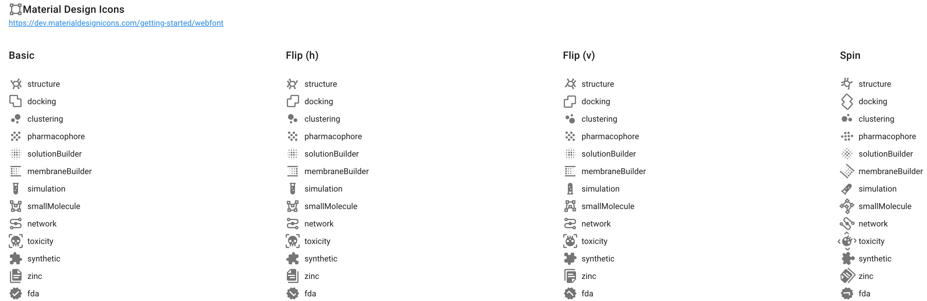
아이콘을 관리하기 위한 테스트 페이지
앞서 말했듯 좀 더 잘 관리되는 아이콘으로 사용되길 원하기 때문에 지금 사용되고 있는 아이콘이 어떤 것들이 있는지 쉽게 확인할 수 있는 페이지를 만들기로 했습니다.
우선 라이브러리에 등록된 모든 아이콘을 보여주는 페이지를 만듭니다.
<!-- src/views/test/Icons.vue  -->
<template>
    <v-container fluid>
         <v-card outlined>
            <v-card-title>
                <v-icon>mdi-vector-square</v-icon>
                Material Design Icons
            </v-card-title>
            <v-card-subtitle>
                <a href="https://dev.materialdesignicons.com/getting-started/webfont">
                    https://dev.materialdesignicons.com/getting-started/webfont
                </a>
            </v-card-subtitle>
            <v-row>
                <v-col sm="6" md="4" lg="3">
                    <v-card-title>Basic</v-card-title>
                    <v-list dense flat>
                        <v-list-item v-for="(icon, key) in icons" :key="`mdi_icon_basic_${key}`">
                            <v-icon left></v-icon>

                        </v-list-item>
                    </v-list>
                </v-col>
                <v-col sm="6" md="4" lg="3">
                    <v-card-title>Flip (h)</v-card-title>
                    <v-list dense flat>
                        <v-list-item v-for="(icon, key) in icons" :key="`mdi_icon_flip_h_${key}`">
                            <v-icon left> mdi-flip-h</v-icon>

                        </v-list-item>
                    </v-list>
                </v-col>
                <v-col sm="6" md="4" lg="3">
                    <v-card-title>Flip (v)</v-card-title>
                    <v-list dense flat>
                        <v-list-item v-for="(icon, key) in icons" :key="`mdi_icon_flip_v_${key}`">
                            <v-icon left> mdi-flip-v</v-icon>

                        </v-list-item>
                    </v-list>
                </v-col>
                <v-col sm="6" md="4" lg="3">
                    <v-card-title>Spin</v-card-title>
                    <v-list dense flat>
                        <v-list-item v-for="(icon, key) in icons" :key="`mdi_icon_spin_${key}`">
                            <v-icon left> mdi-spin</v-icon>

                        </v-list-item>
                    </v-list>
                </v-col>
            </v-row>
        </v-card>
    </v-container>
</template>

<script>
import Icons from '@/plugins/vuetify/icons'

export default {
    name: 'Icons',
    data() {
        return {
            icons: Icons.values,
        }
    },
}
</script>
그리고 만들어진 페이지에 URL 연결을 해 주었습니다.
// src/plugins/router/index.js

const routes = [...]

const testRoutes = [
    {
        path: '/test/icons',
        name: 'IconTest',
        component: () => import('@/views/test/Icons'),
    },
]

const router = new VueRouter({
    mode: 'history',
    base: process.env.BASE_URL,
    routes: [
        ...routes,
        ...testRoutes,
        {
            path: '*',
            component: () => import('@/views/NotFound'),
        },
    ],
    scrollBehavior() {
        return { x: 0, y: 0 }
    },
})

export default router
이제 만들어진 페이지가 잘 보이는지 확인합니다.
http://localhost:8080/test/icons


댓글남기기